
A triangle can created in CSS using the clip-path property.
clip-path allows to clip an element to a given shape. The section that is inside the shape is shown, while that outside is hidden.
Example
HTML & CSS :
<div id="triangle"></div>#triangle {
background-color: #003BDE;
clip-path: polygon(50% 0, 100% 100%, 0 100%);
width: 100px;
height: 100px;
}
Specifying a Triangular Shape in clip-path
To create a triangle we need to use the CSS polygon() shape function. This function creates a polygon shape by joining the co-ordinates of the vertices that we pass as parameters.
A triangle has 3 vertices, so we will need to pass the co-ordinates of the 3 vertices. Co-ordinates are calculated with respect to the top-left corner of the element which is considered as the origin.
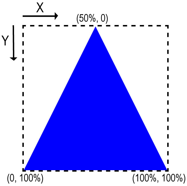
By changing the dimensions & co-ordinates of the polygon, we can create different types of triangles.
-
#triangle-1 { clip-path: polygon(50% 0, 100% 100%, 0 100%); } -
#triangle-2 { clip-path: polygon(0 0, 50% 50%, 0 100%); } -
#triangle-3 {
	clip-path: polygon(0 0, 100% 100%, 0 100%);
}